
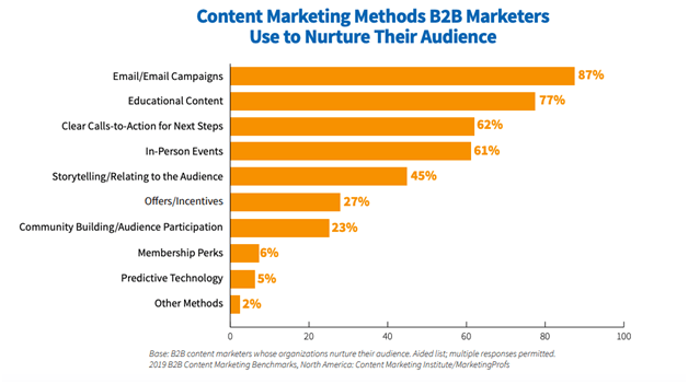
Businesses nurture their target audiences primarily via content delivered by email.
These are the findings of the recent Content Marketing Institute report, which found that 87 percent of respondents said that email campaigns were the most effective method to nurture leads and convert them into paying customers.
Source: Content Marketing Institute
As you can see, emails even outperformed such heavyweights of marketing as in-person events and incentives.
However, to get the point of having a good email list of leads to nurture, one has to build it.
Thankfully, emails are just as effective here, as your site can become a lead-generating machine if you know what to do. When you amass a decent number of emails, you can conduct cold emailing and other campaigns.
Here’s what you’ll learn about how to collect emails and grow the lead base:
Table of Contents
● Add Pop-Ups on Your Website
● Provide Signup Forms On Your Website
● Offer Discounts In Exchange For Email
● Collect Emails on Customer Service Requests
● Place Many CTAs on Your Website
● Final Thoughts.
Let’s begin.
How to Grow Your Email Marketing List -
1. Add Pop-Ups on Your Website
Pop-up windows get a bit of a bad rap, often due to the fact that they cover the content and interfere with a visitor’s experience on a website. However, if implemented properly, they can do a decent job of getting you more leads.
Here’s what I mean “proper implementation.”
The best business is customer-driven, i.e. everything it does has some value to its target audience. This principle is perfect to apply in the case of pop-ups.
Think about what your target customers would like to get from you and what you can give away for a lower price or for free. Is it a discount? Is it a fresh industry review that CEOs are after? Or maybe a free consultation?
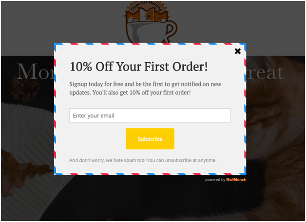
Let your pop-up window share this offer with the visitors of your website who might be interested in it. Here’s a simple example of a pop-up window that has value for customers, courtesy of Three Cat Morning, a coffee seller.
Source: Threecatmorning.com, screenshot
2. Provide Signup Forms On Your Website
Signup forms were created to help online businesses get subscribers and leads by offering them different rewards, including a free trial or content (an important industry report, white paper, etc.). The best thing about signup forms is that you can implement them in a variety of ways.
For businesses, signup forms are a must-have website element that should be out there putting your high-converting cold email templates to work. Here are some ways in which businesses are using them right now.
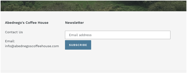
Abednego's Coffee House, a coffee retailer, has a signup form to encourage the visitors to subscribe to the company’s newsletter at the bottom of their home page and other pages throughout the website.
Abednego's Coffee House, screenshot
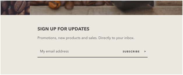
To increase the chances that more people will subscribe to your newsletter, you can let them know about the benefits of doing so. For example, the above-mentioned Three Car Morning coffee clearly describes what subscribers receive when they sign for updates from the company.
Source: Threecatmorning.com, screenshot
Approaching a lead (who is a coffee buyer) with an awesome networking coffee email would be the next step in the lead nurturing process.

While going with a basic signup form is a good idea, sometimes it’s not the best way to go. For example, if you’re providing consulting services, you may need to collect a bit more information in signup forms to know how to approach a client in a more personalized way.
Making sure that your email is error-free and will not embarrass you in the eyes of a potential client or partner. That’s why checking your email copy with online tools like TrustMyPaper, Grammarly, Studicus, and WowGrade is highly recommended.
This is exactly what KMP Business Consulting Services does. Their website’s contact & signup form requires more details from the visitors, including a subject, an address, and a message.
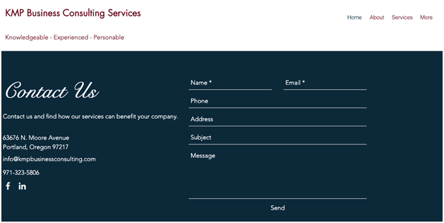
Source: kmpbusinessconsulting.com, screenshot
3. Offer Discounts In Exchange For Email
This is another great way to incentivize visitors to leave their emails. By promising a discount in exchange for an email address, you’re making an offer many people can’t refuse. I mean, a customer can get a discount for giving up an email address, which is basically nothing. This can be hard to resist.

Credit: PictureQuotes
For example, BulkBookStore, an Oregon-based book wholesale distributor, offers to reduce the price of the order by 10 percent if you sign up for their email list. Not too shabby, right?
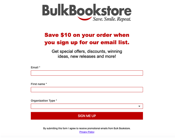
Source: Bulkbookstore.com, screenshot
On top of the discount, the company promises to share special offers and ideas. That’s a good incentive to sign up.
4. Collect Emails on Customer Service Requests
Let’s suppose someone browses your website and becomes interested in your products or services. Emailing you directly is an option, but they prefer to get quick answers, which is exactly what that live chat option on our website is for.
For example, you can require an email address to talk with the customer support representative or consultant. It takes about five seconds for the visitor but can make a big difference for your email list building effort.
Here’s how the above-mentioned Bulkbookstore does this.
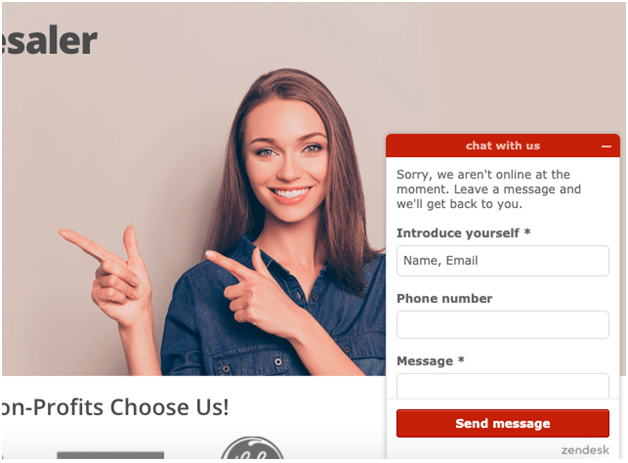
Source: Bulkbookstore.com, screenshot
Not only this form collects emails, but also phone numbers and emails, which are also tremendously important pieces for building lead bases and personalizing cold emailing.
5. Place Many CTAs on Your Website
A CTA, or call to action, is a way to encourage customers and leads to complete the actions you’d like them to take. They can take two forms: textual and button-based, you should definitely go for both.
First, textual CTAs are essentially imperative sentences that you can place throughout your website to instruct the visitors to perform a certain task, i.e. sign up for a consultation, read a blog, leave a comment, or try your product for free.
Second, button-based CTAs are more likely to be noticed by a visitor because they typically stand out from the rest of the content. They guide leads and visitors towards your goal: conversion.
Here’s an example of both CTAs, courtesy of Herman Miller, a Michigan-based furniture seller. The text-based CTA is followed by a CTA button, which stands out beautifully due to the contrast between the button color and the background color.

Source: Hermanmiller.com, screenshot
The example above is a call to sign up for a newsletter. You can also use CTA buttons to lead the visitors to your landing page where all the magic happens. Below is an example of such a CTA from Herman MIller (“Learn More”).

Source: Hermanmiller.com, screenshot
While there’s no universal formula for the best CTA button text, making it action-oriented and as less pushy as possible is the best way to go:
● Sign up for a free trial
● Book a consultation
● Speak to an expert.
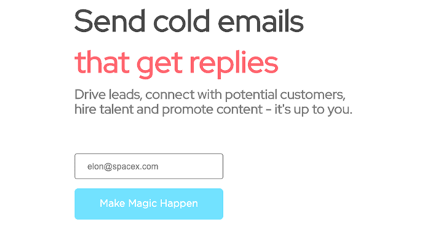
Feel free to be creative with the CTA copy, too. The folks at LemList did just that, and it looks awesome.
Final Thoughts
Having a constantly growing email list is a must for businesses because emails are the most common lead nurturing method. To build it, you need to have a bunch of signup forms, pop-up windows, and other tools we’ve mentioned here, working 24/7 on getting you quality leads.


1 Comments
Thank you for the great article. This information helped me a lot in my work. I hope you will continue in the same spirit. All the best and good luck!!
ReplyDelete